

Flow Reflexology were looking for a refreshed brand identity and increased online presence in the wake of the Covid-19 pandemic.
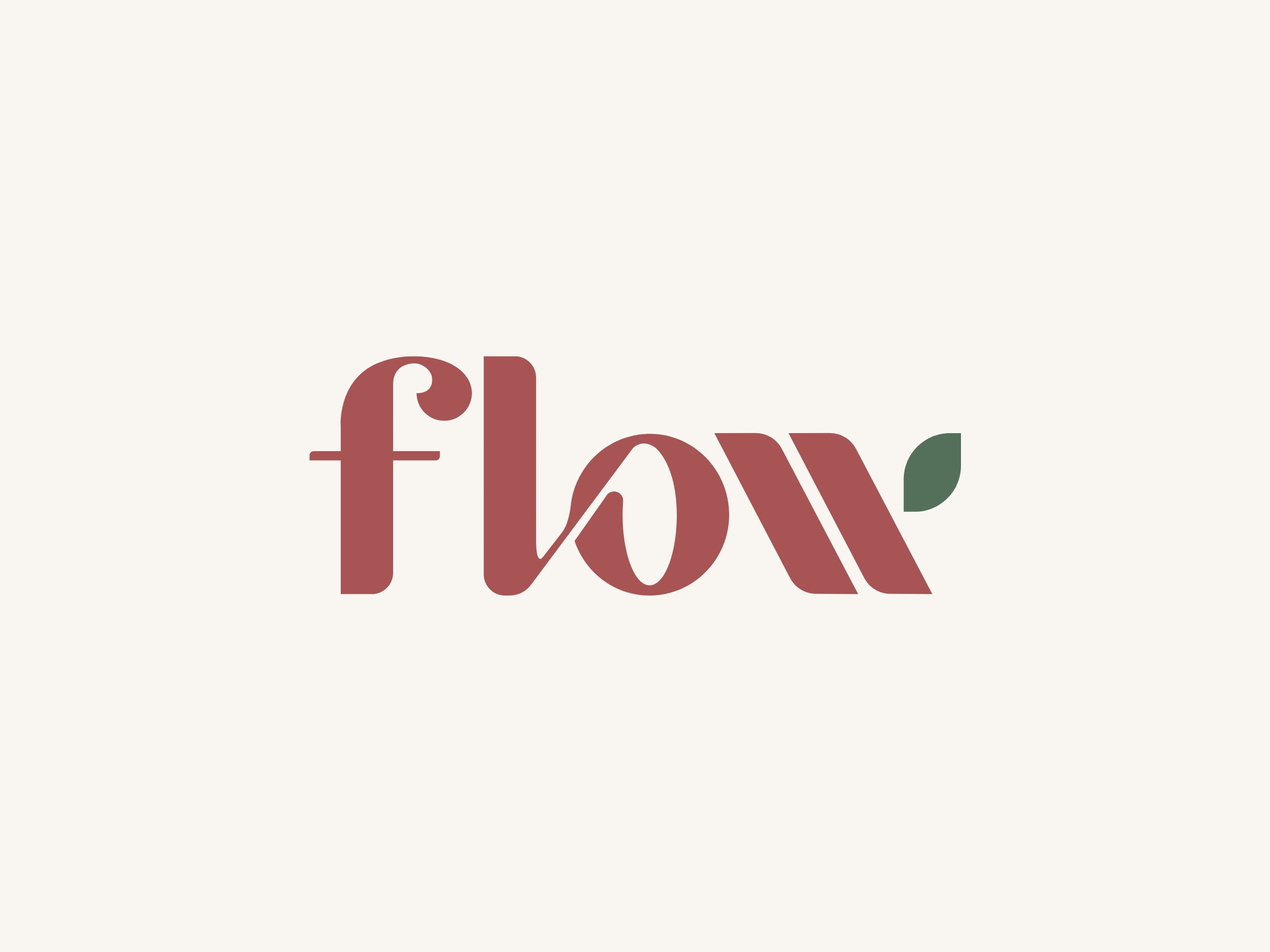
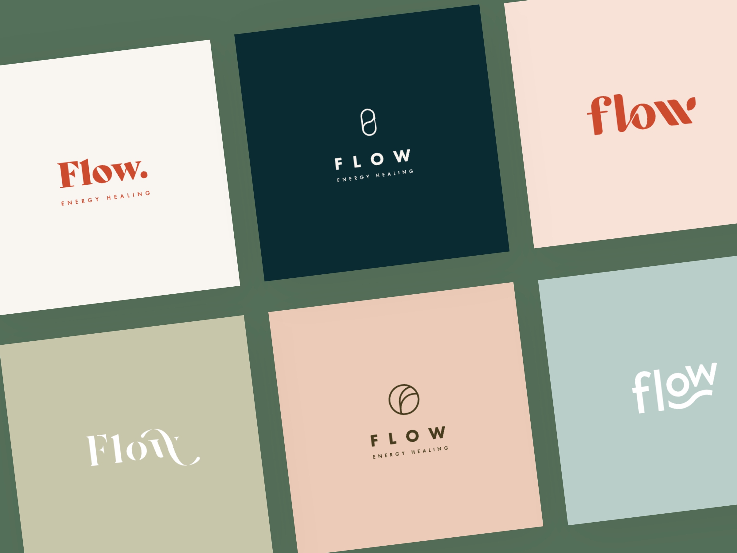
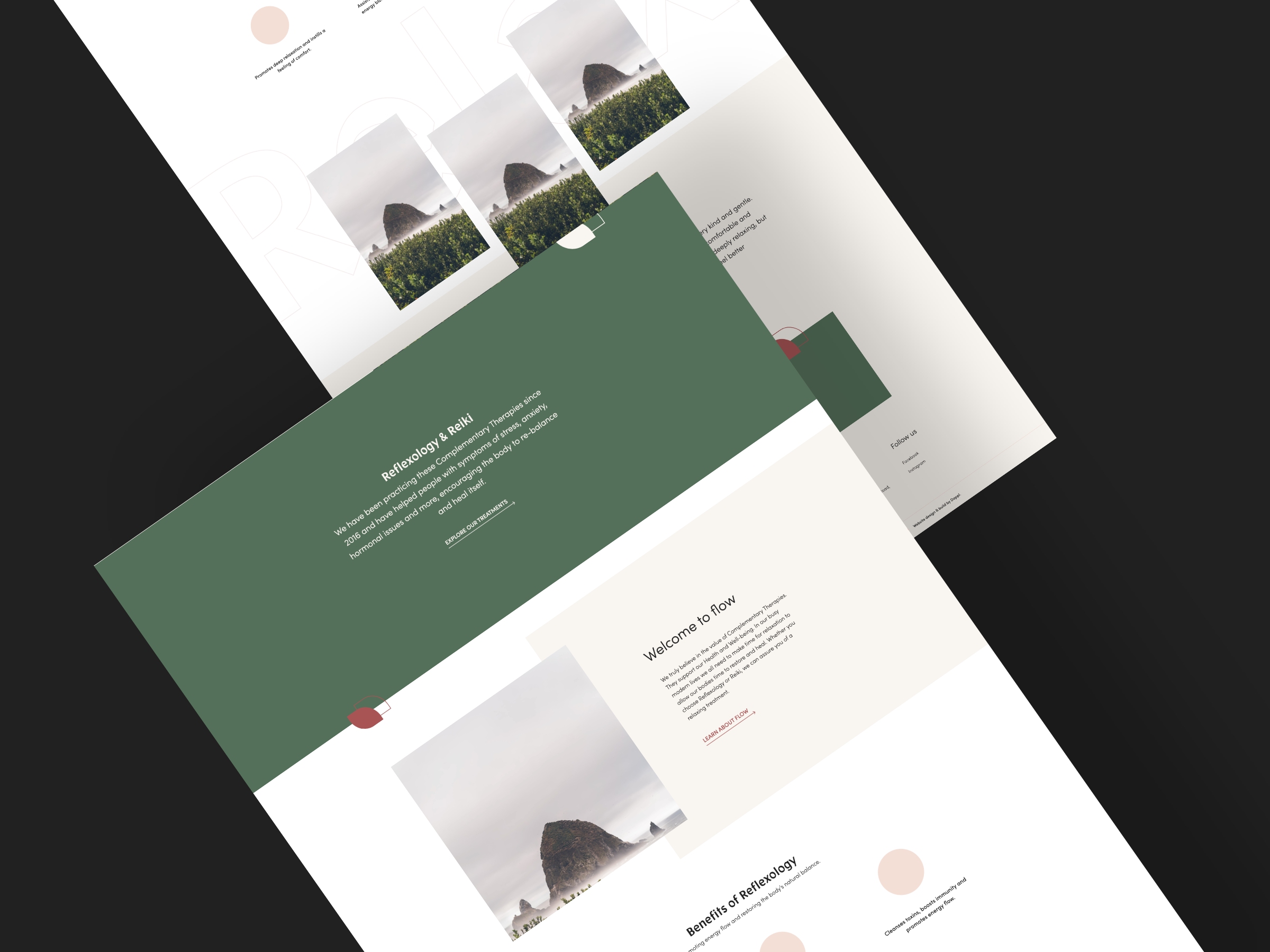
Working with the client to understand their goals and the core values of the business, I created a selection of brand directions centred around themes of energy flow, earth tones and simplicity.
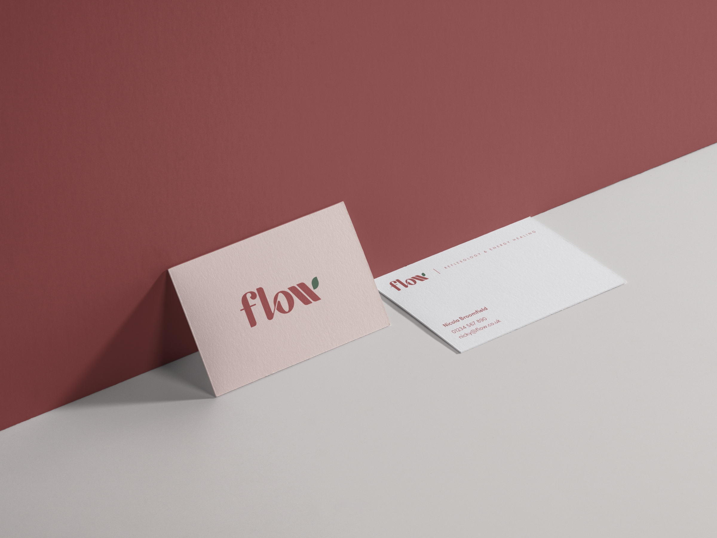
Once the client had chosen a visual direction, I worked to develop the brand to be versatile across a range of touch points, including business cards and print advertisements.
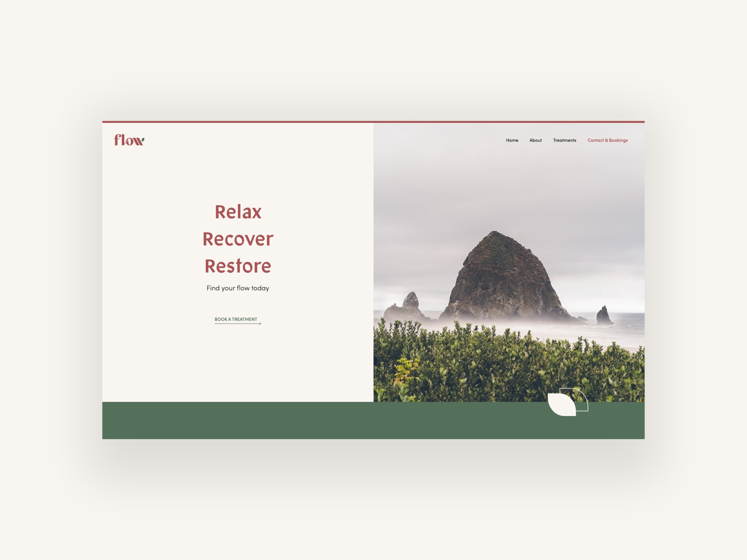
I then translated the established brand into initial website designs to give an idea on how this would apply in a digital space.
